Figma Design System Widget
- Figma Design System Widget
- Color Set Tokens
- Typography Set Tokens
- Icon Tokens
- Font Awesome Integration
- Effect Tokens
- Breakpoint Tokens
- Custom Tokens
- Component Tokens
- Downloading Code
- Deployment - Github NPM Packages
- Github Configuration
- Style Guide
- Design System Lifecycle
- Build Information
Project Abbreviation: FDS
Figma Widget URL: https://www.figma.com/community/widget/1219461874726507820
Production URL: https://figmadesignsystem.app/
Figma Design System Widget
Figma Design System Widget is an attempt to integrate design system concerns (ADA, color/typography sets) with Figma structures (styles, components) as well as explore how much of a design system build tool can be created entirely within Figma leveraging existing services (Font Awesome, Google Fonts, Github repos/npm packaging).
This widget can build a significantly sized design system token set by dragging the widget on stage, choosing a name and building out the various parts of your system. From there, you can tokenize, transform (css, scss, Javascript, and Typescript), and deploy your design system all the way into a Github hosted NPM Package. It isn't designed to be used for large production designs systems quite yet, but is perfect for small to medium sized projects or for just exploring your first full design system.
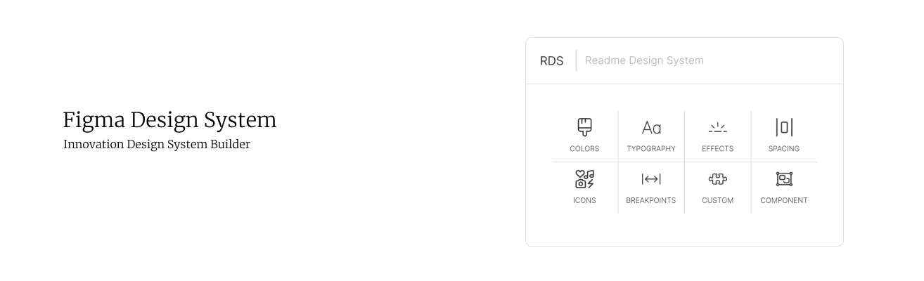
Figma Design System Intro, source: contentful, figma
Color Set Tokens
- Color Sets. Design Systems usually step colors, so this widget will kick off creating values by choosing your step pattern and base color (the color in the center of the steps).
- Figma Styles. All colors created within the widget are automatically synchronized with native Figma styles.
- Editing All Steps. Editing one color will show all of the other dots for the other steps. The selected color will have the biggest selector, but all other selectors will be editable as well. Build a better color arc of stepped colors.
- Locking Hue. During editing of any one color you can lock the hue and change the hue for all colors.
- ADA feedback. Design Systems can be built with conventions where each color can work with ADA compliance at specific steps. This widget will surface that information and make it easy to knudge your colors into ADA compliance.
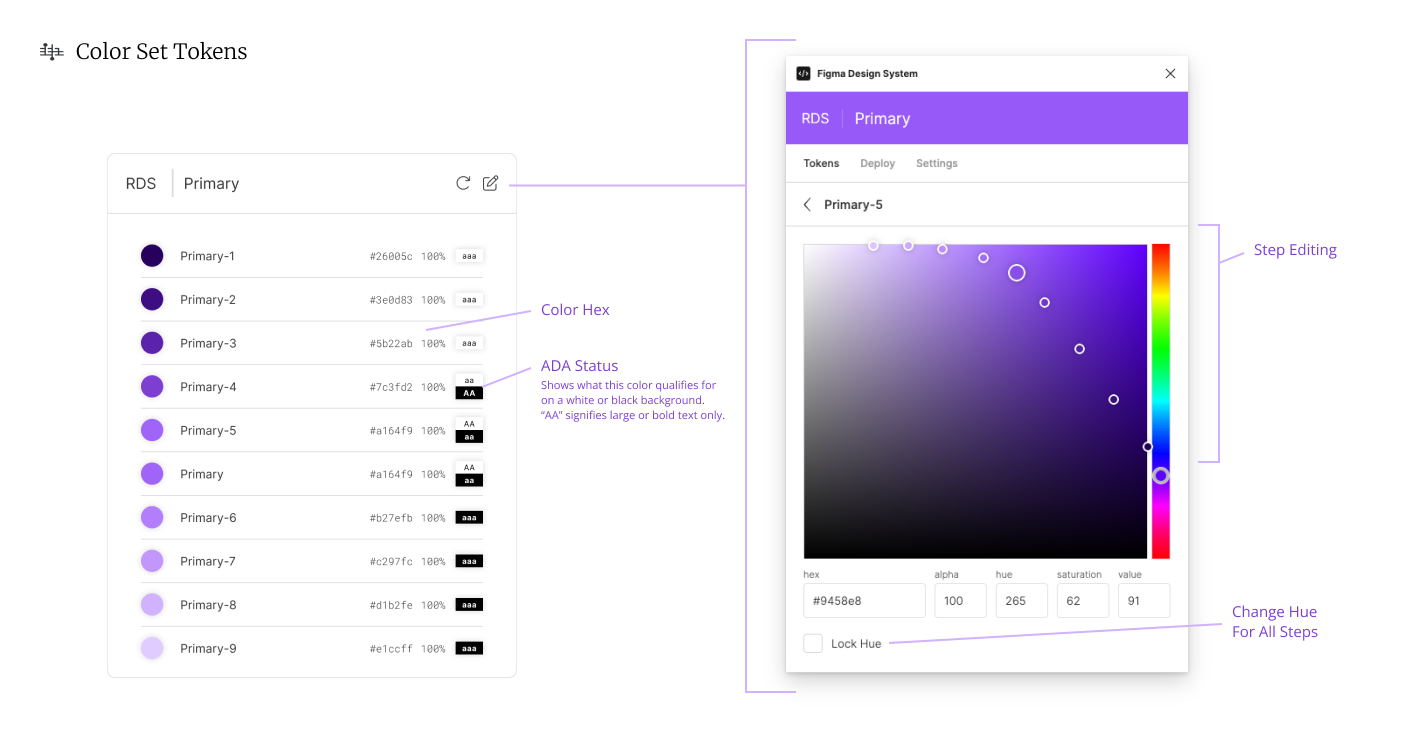
Color Set Tokens, source: contentful, figma
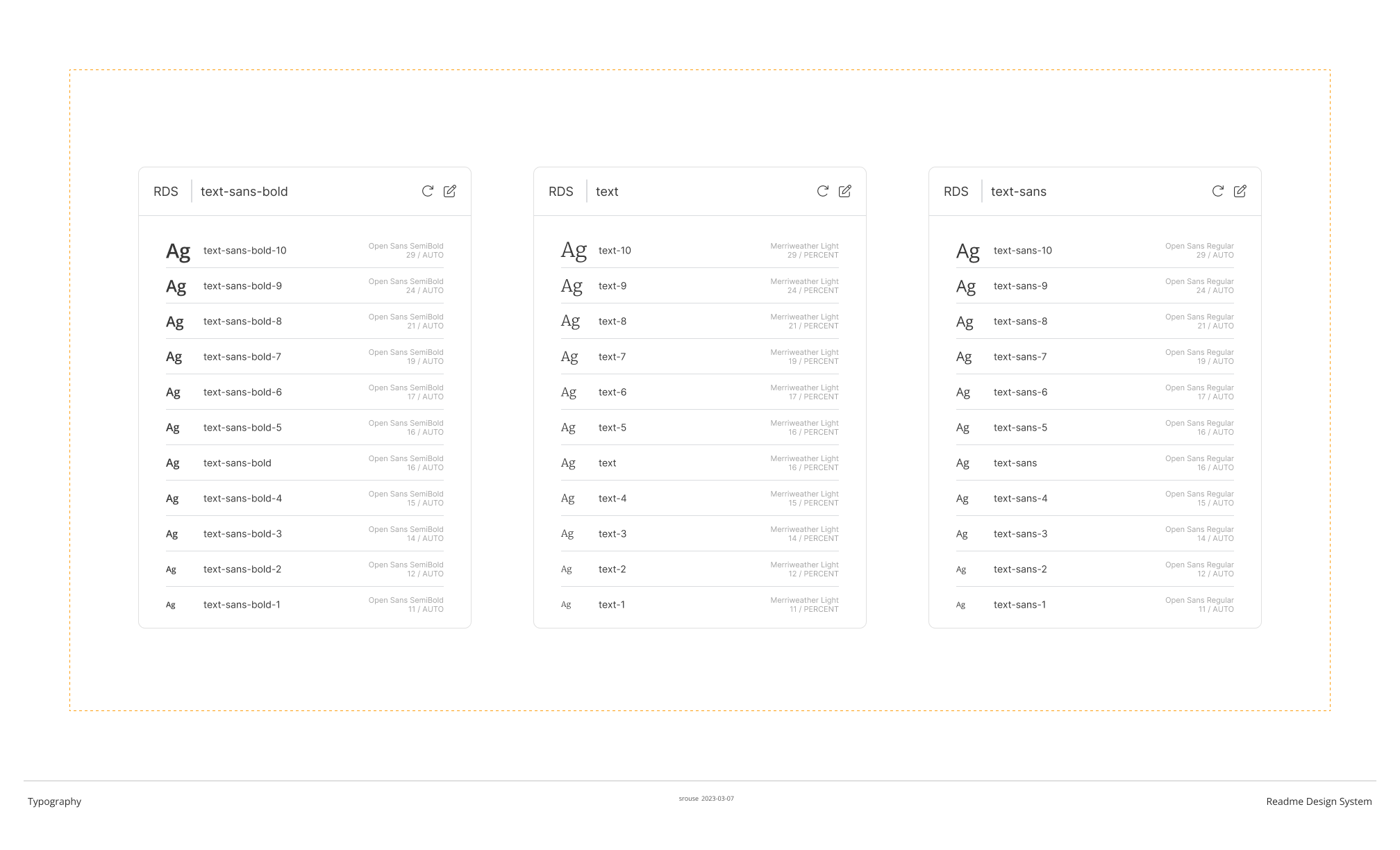
Typography Set Tokens
- Typography Sets. Typography can also be managed as a set. A typography token can be created one by one, but also by choosing a set patter with a base font, weight, and size.
- Google Fonts. The tokens created with the widget are transformed into a Google Fonts embed, so each of the previews (the large sentence and the individual thumbnails) are directly from Google Fonts. If they are not available in Google Fonts (and thus not able to be transformed into a simple css file) you will be alerted immediately.
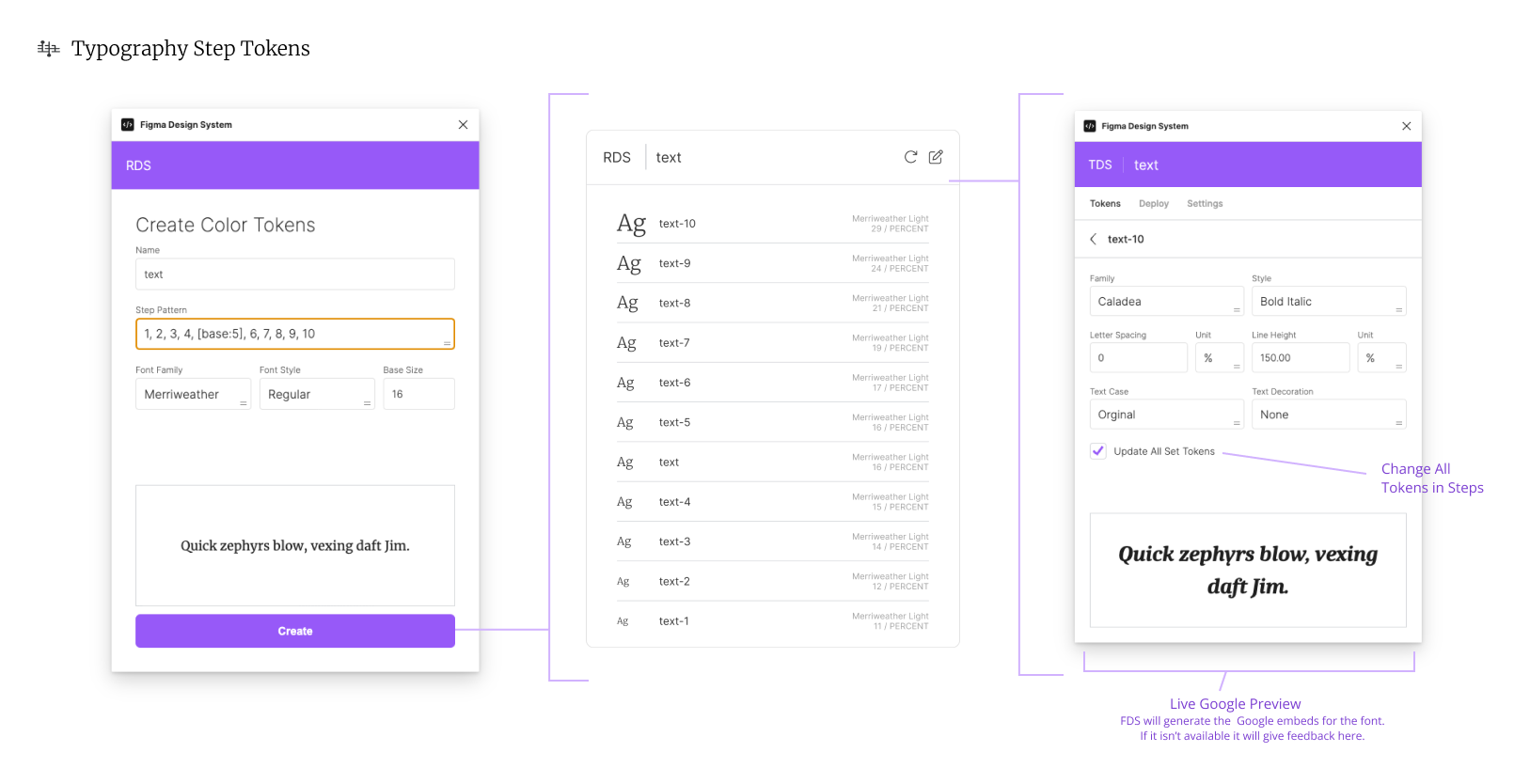
Typography Step Tokens, source: contentful, figma
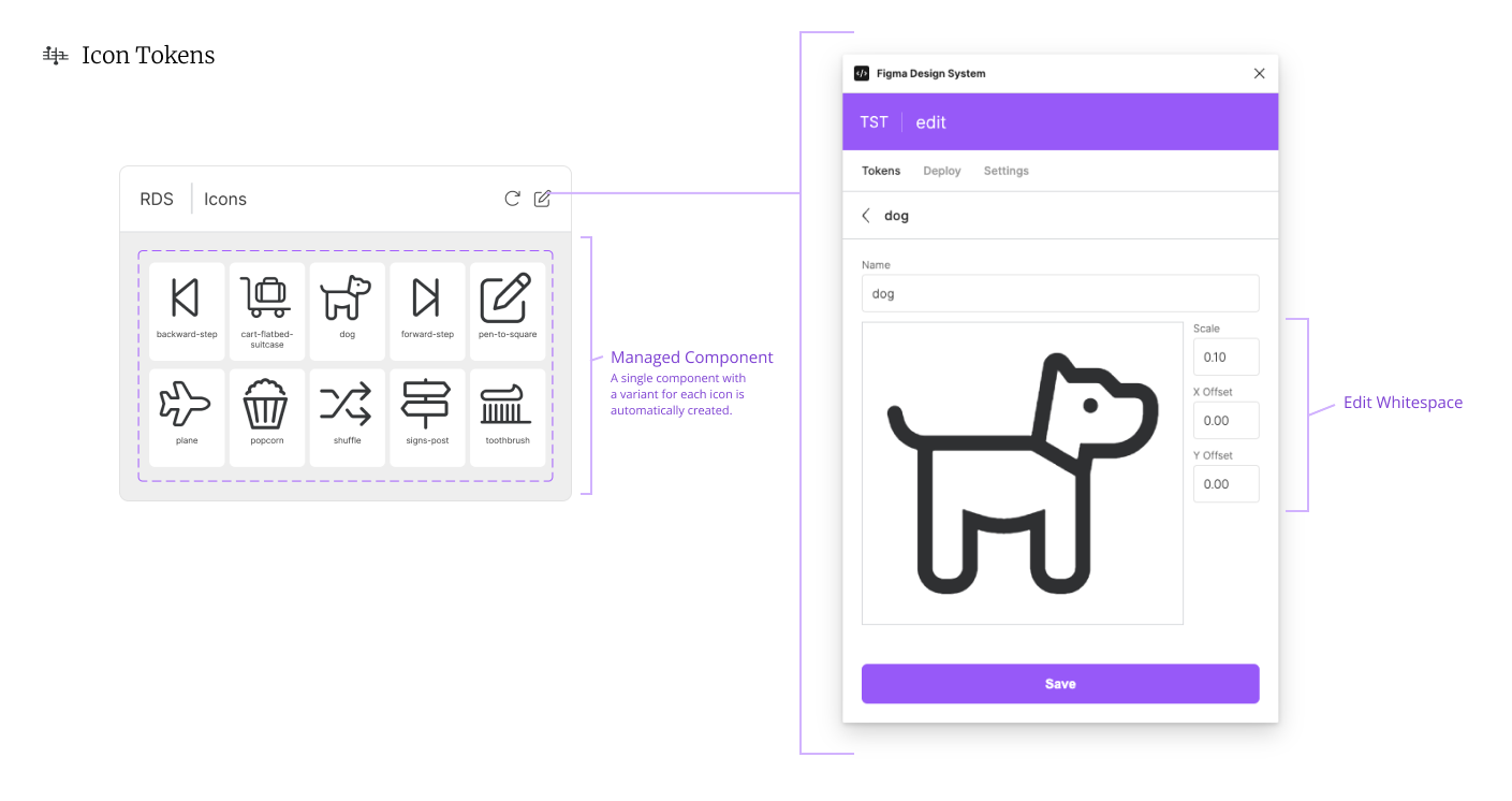
Icon Tokens
- Multiple Sources. In creating a new icon, you can choose from uploading an svg, selecting an icon on the Figma stage, or downloading from Font Awesome.
- Font Awesome Integration.
- Automatic Icon Component. The widget will automatically create a component that has variants in the names of the icons you create. The widget is actually wrapped around that component.
- Spacing and Offset. Some icons work better flush to the edges and some do not. The widget will allow you to scale and nudge each specific icon into place.
Icon Tokens, source: contentful, figma
Font Awesome Integration
The Font Awesome integration includes using your paid subscription. To use all the available icons in your subscription, you will need to create an api token and a kit that includes these icons. The widget will walk you through attaching that kit via the API token.
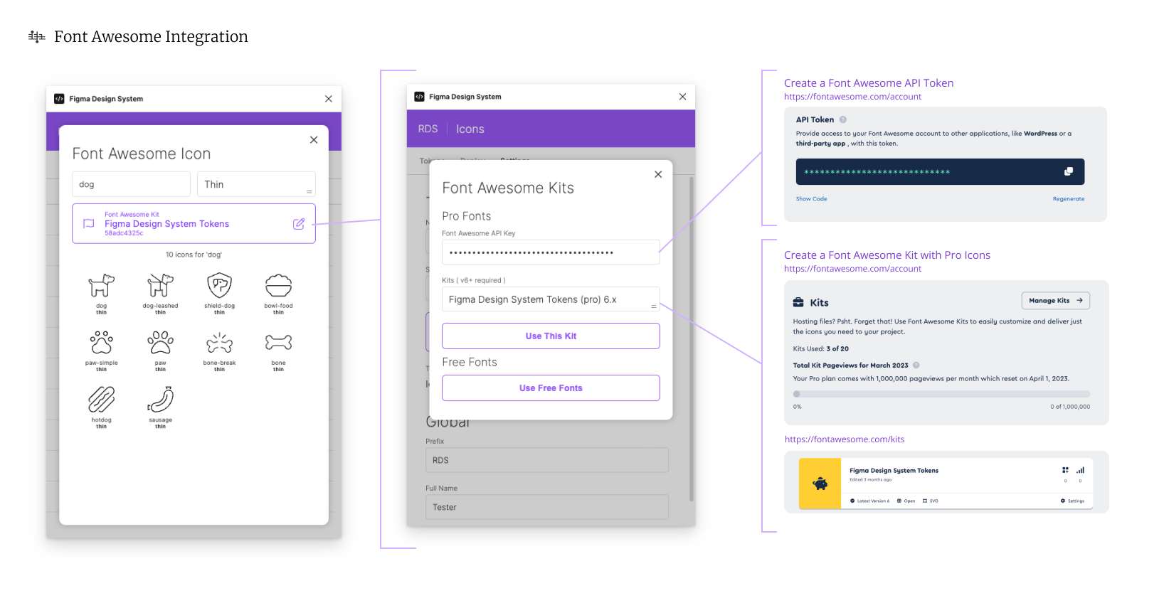
Font Awesome Integration, source: contentful, figma
Effect Tokens
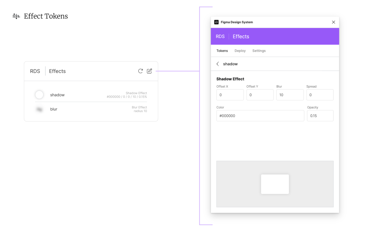
Effect Tokens, source: contentful, figma
Breakpoint Tokens
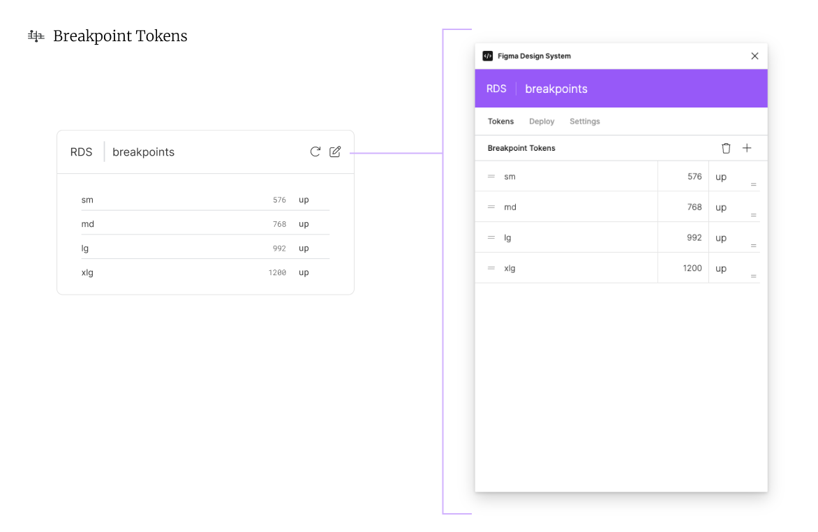
Breakpoint Tokens, source: contentful, figma
Custom Tokens
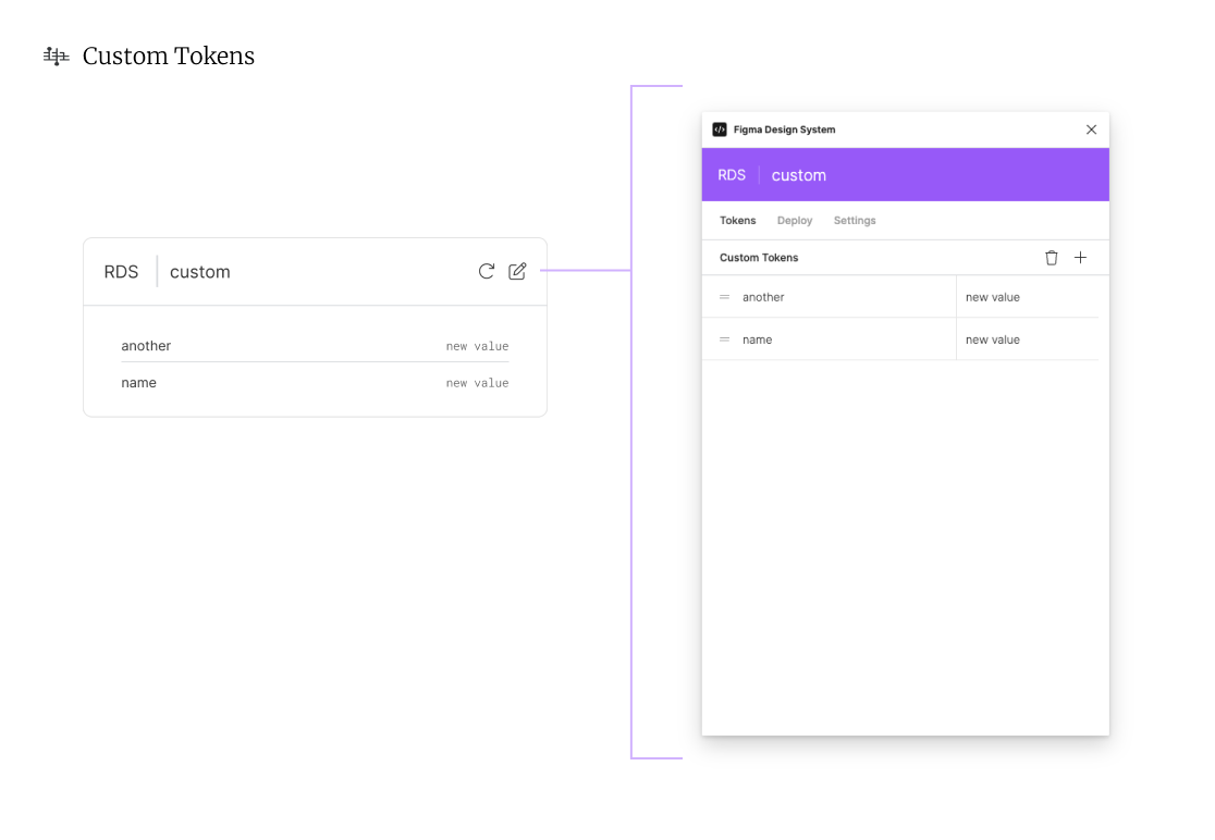
Custom Tokens, source: contentful, figma
Component Tokens
(Not presently implemented) Component tokens will be created from attaching a component to the Figma Design System widget. They will only create scss transformations since direct css will create relatively unweildy results.
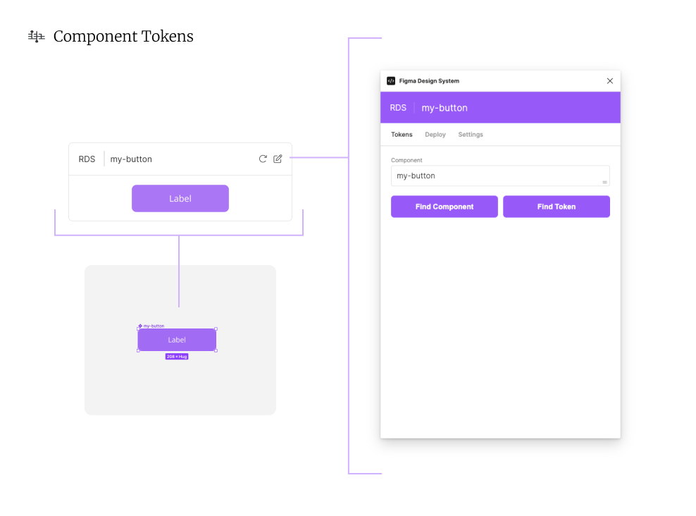
Component Tokens, source: contentful, figma
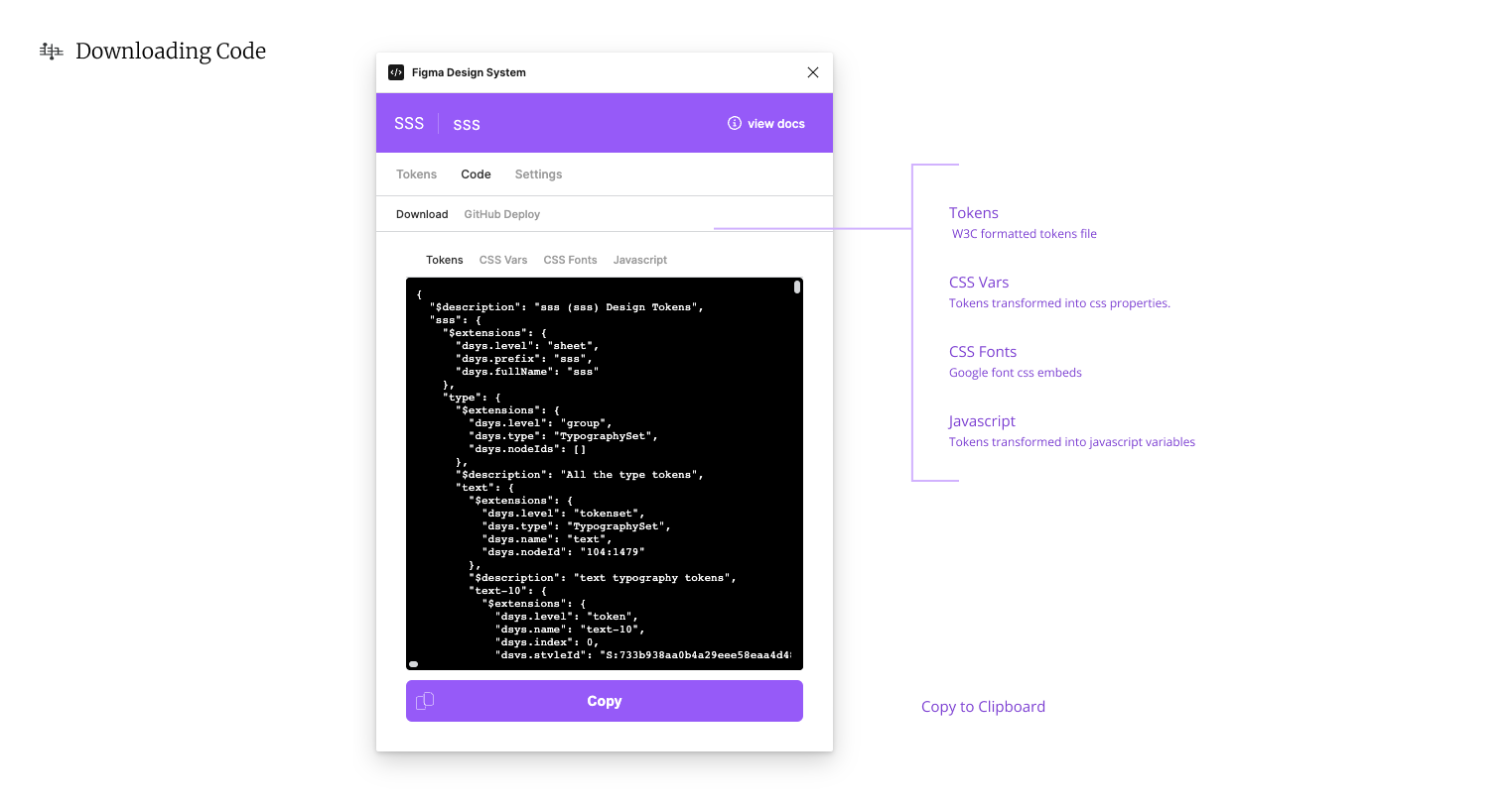
Downloading Code
Tokens can be transformed instantly and copied to your clipboard with several different outputs:
- Tokens. W3C formatted tokens
- CSS Variables. Tokens transformed into css properties.
- CSS Fonts. Google font css embeds
- Javascript. Tokens transformed into a javascript object.
This is a subset of all the transformations available with the Figma Design System widget. If you would like to use the Typescript or Atomic transformations you will need to use the GitHub Deploy.
Downloads, source: contentful, figma
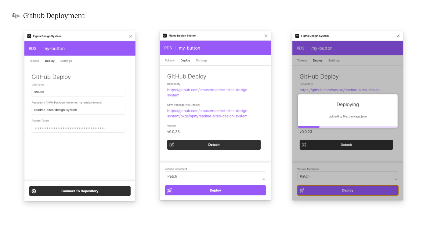
Deployment - Github NPM Packages
Deployment and Github NPM Packages.
Github Deployment, source: contentful, figma
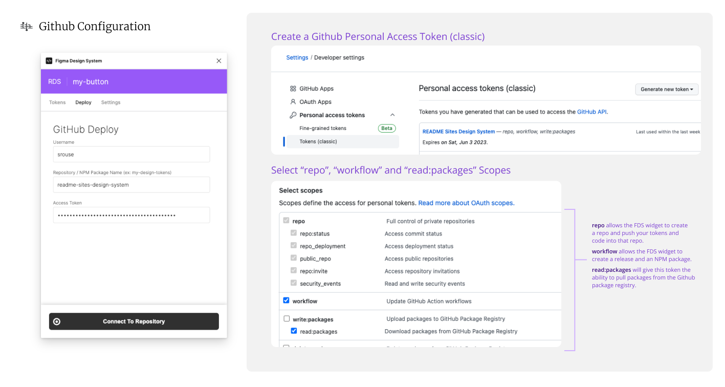
Github Configuration
The tokens created with the Figma Design System widget can be immediately transformed on deployment and deployed to a Github repo as well as a Github NPM package. This requires a Github account and an access token that has workflow and read:packages permissions (see below).
Note: The Figma Design System plugin will create and configure your Github repo for you, so enter a name of a repository that does NOT yet exist.
Github Configuration, source: contentful, figma
Style Guide
A good design system documents in the same motion that it captures values. The Figma Design System is a living document that can be composed and presented as you will with each token set presented clearly in each widget.
View Readme Design System Style Guide PDF
Readme DSys - Typography Page, source: contentful, figma
Design System Lifecycle
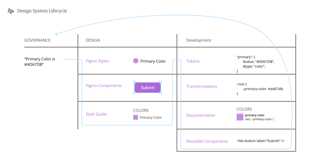
Design System Lifecycle, source: contentful, figma
Build Information
Dynamically built using contentful-readme-generator. Do not edit directly.
updated: 4/22/2023, 9:22:33 PM
space: rtkhko6y3s3u
environment: master
entity id: 2VGzXFpO7HEpkpuLuKgETd